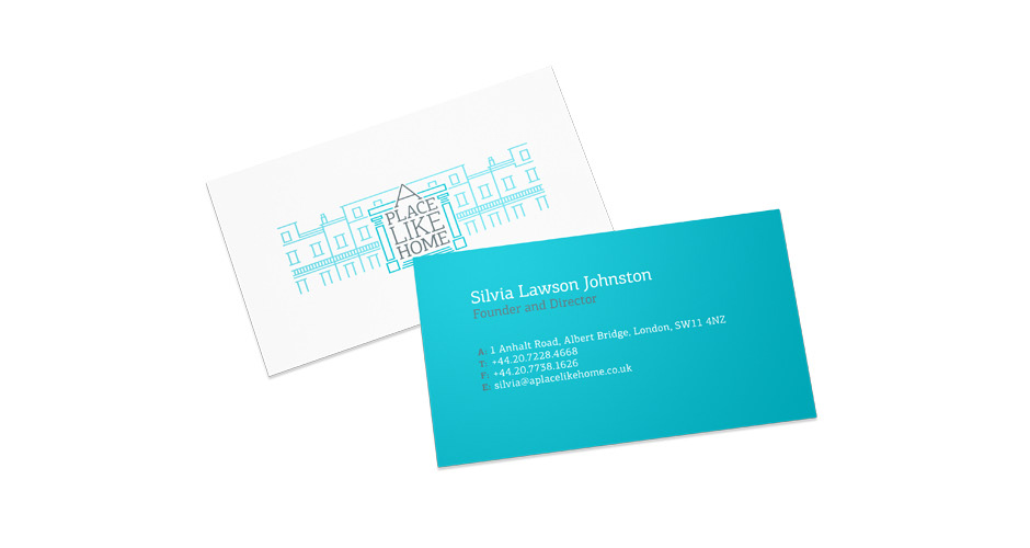
Logo for London based A Place Like Home, a boutique vacation rentals agency in the heart of London. All of their properties are privately owned apartments and houses that have been carefully chosen to offer the highest degree of comfort and the ideal central London location, with transport, shopping, restaurants, museums and galleries within easy reach.
After discussion with the people at APLH, we agreed that the new logo should be something characteristic of the kind of areas of London (Chelsea, Fulham, Kensington, etc.) that their properties are on, so that potential clients would get the correct vibe from the beginning. With that in mind we decided to make use of the beautiful architecture of those areas and combine it with suitable typography.

Also, in order to cover all of APLH's needs, we designed three versions of the new logo. Two for traditional uses on print and web and a third one specifically for social media use.