Logo and branding for “Eagles”, a group within ActionAid International.
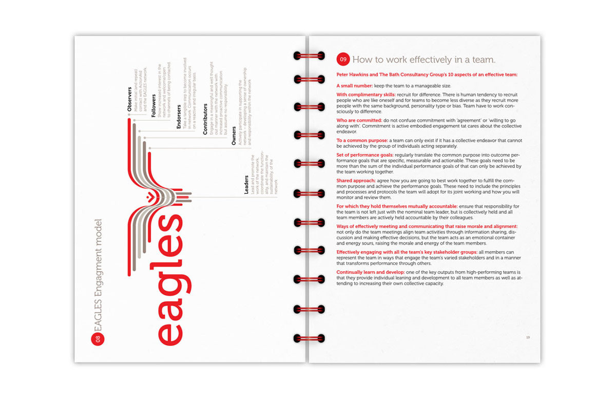
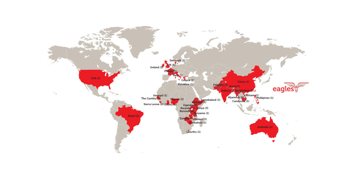
“Eagles” are a team within the Action Aid team. They are people that even though are spread in various locations around the globe, they work together for the same cause, connected to each other through Action Aid’s network.
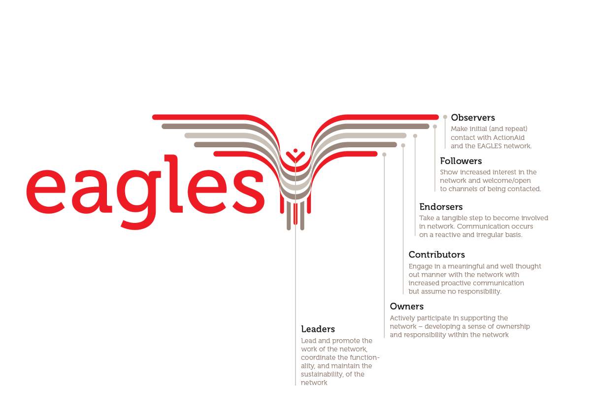
This dynamic was the element we based the logo on. The red and grey lines (colours borrowed form the Action Aid corporal identity) symbolize the ties that connect the Eagles members to each other. It’s a simple yet powerful design solution that also provided an answer to our client’s request, to come up with something that is not as aggressive, as images of eagles typically are.
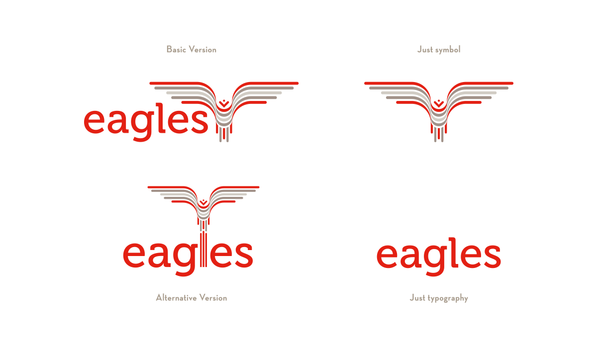
Logo and Alternatives
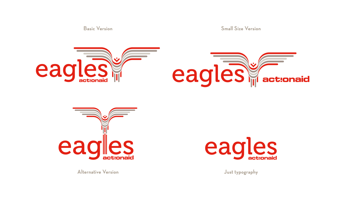
Logo combined with Action Aid Logo
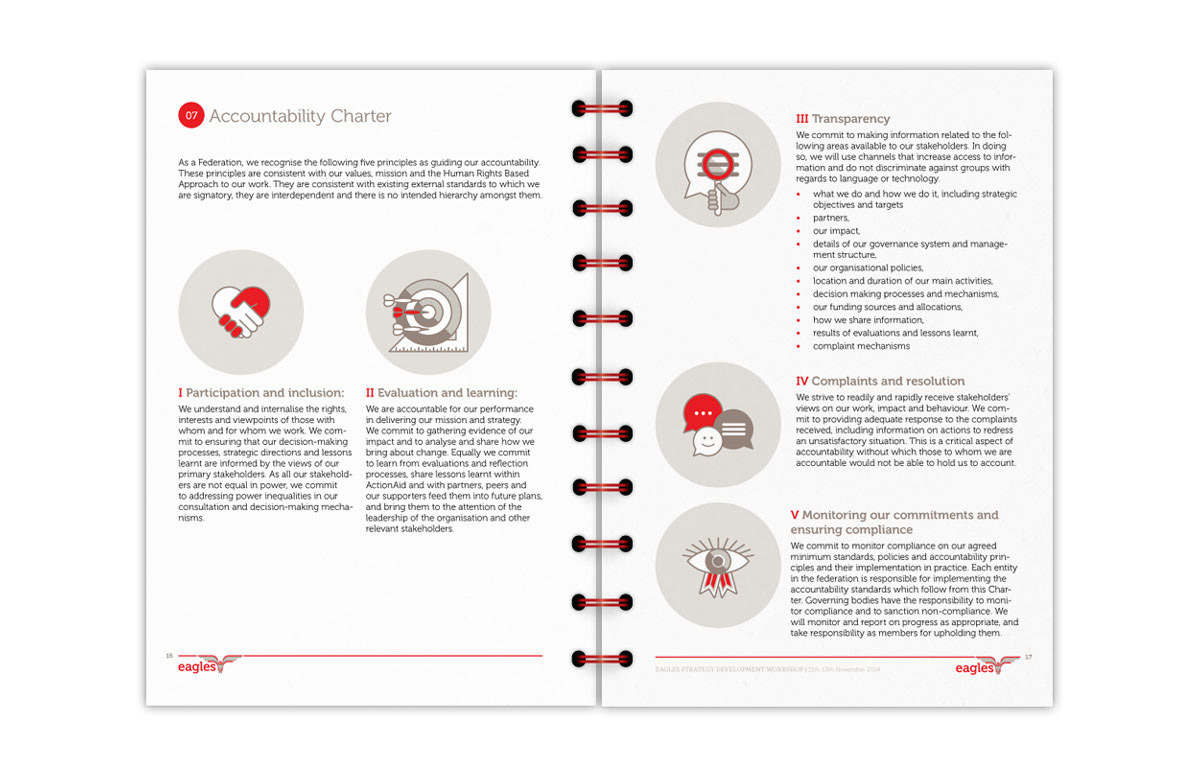
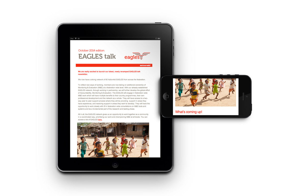
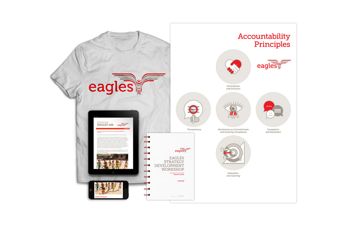
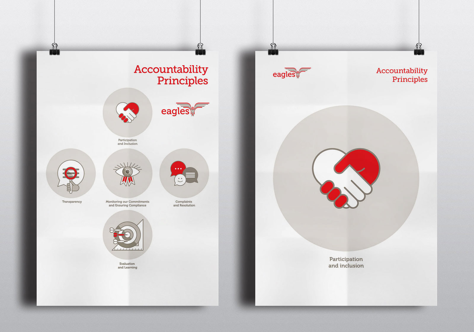
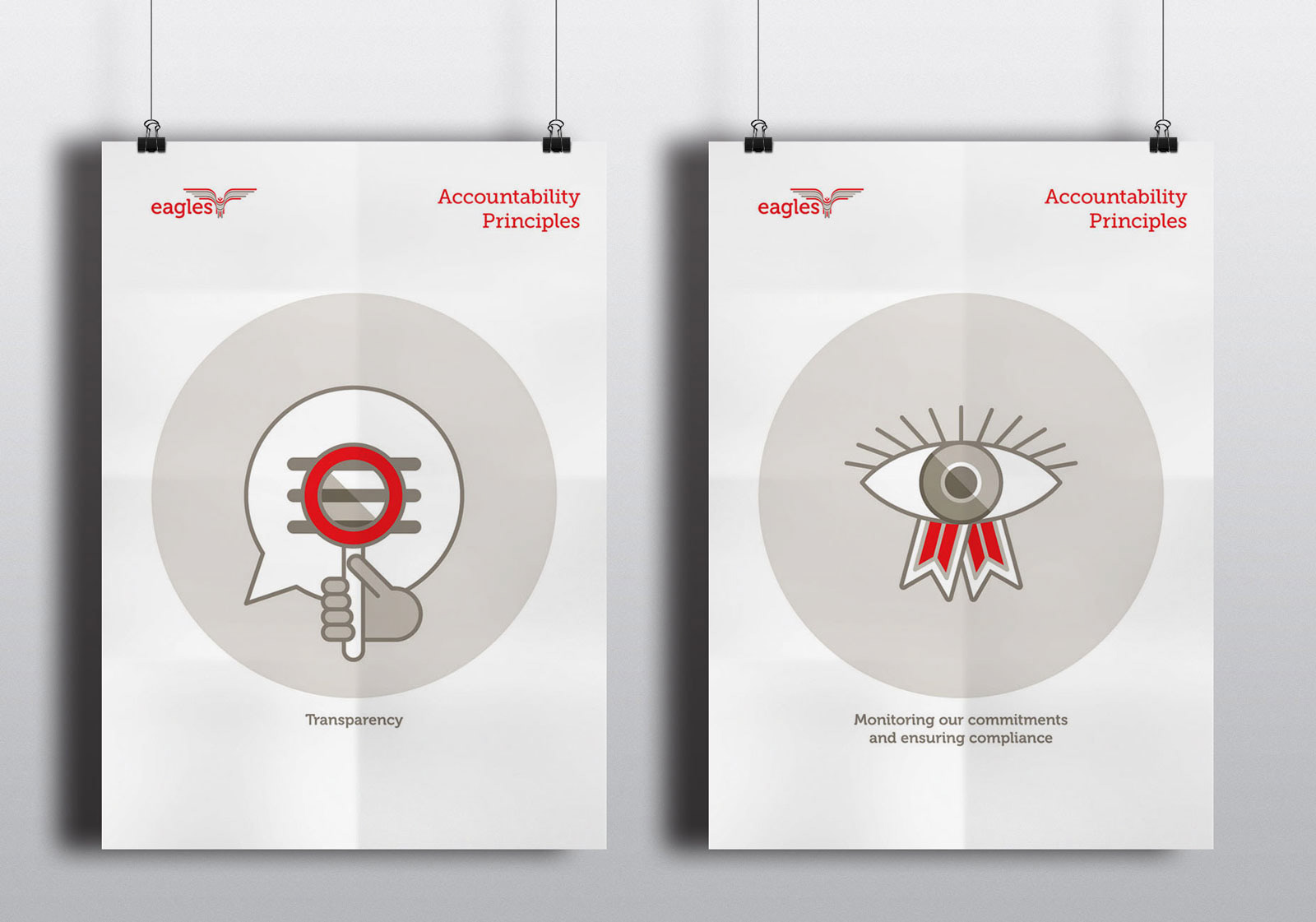
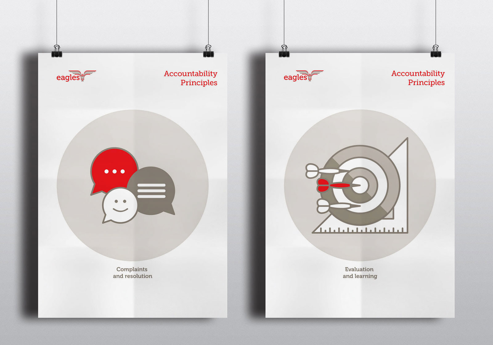
For the logo applications, we designed a newsletter template, a small handbook for an upcoming workshop along with a t-shirt and a series of posters for the accountability section. For that we designed five different symbols to illustrate the accountability principles.