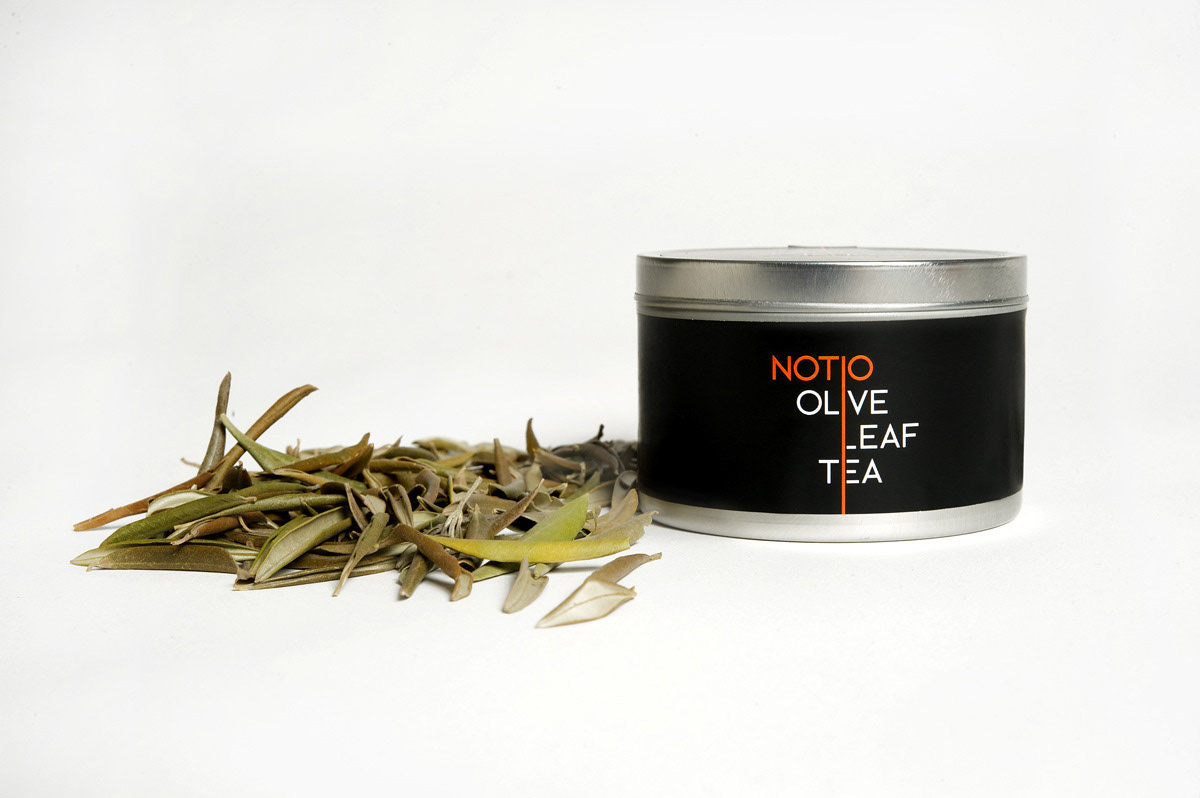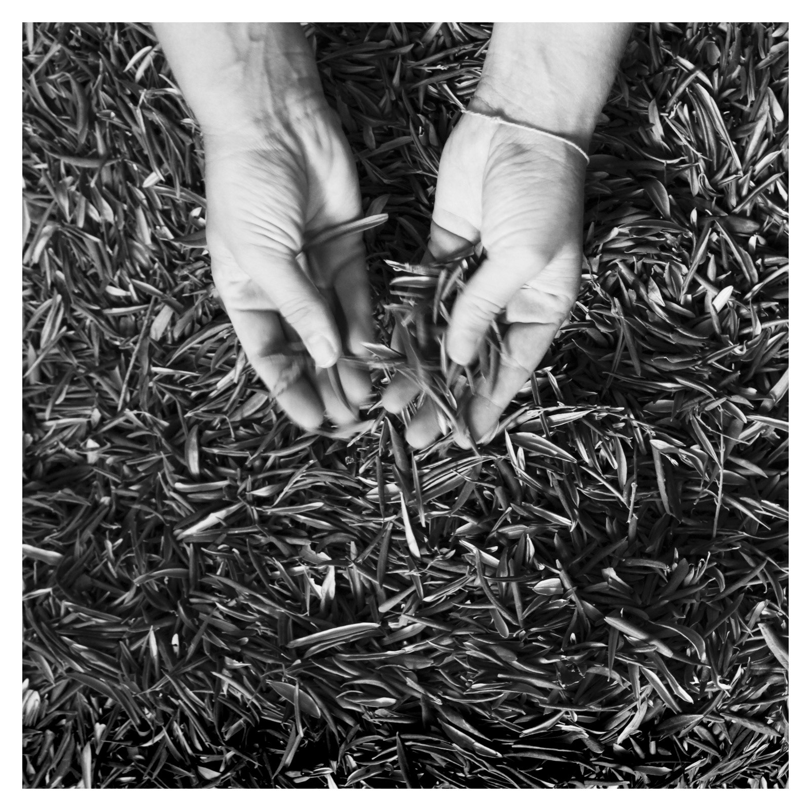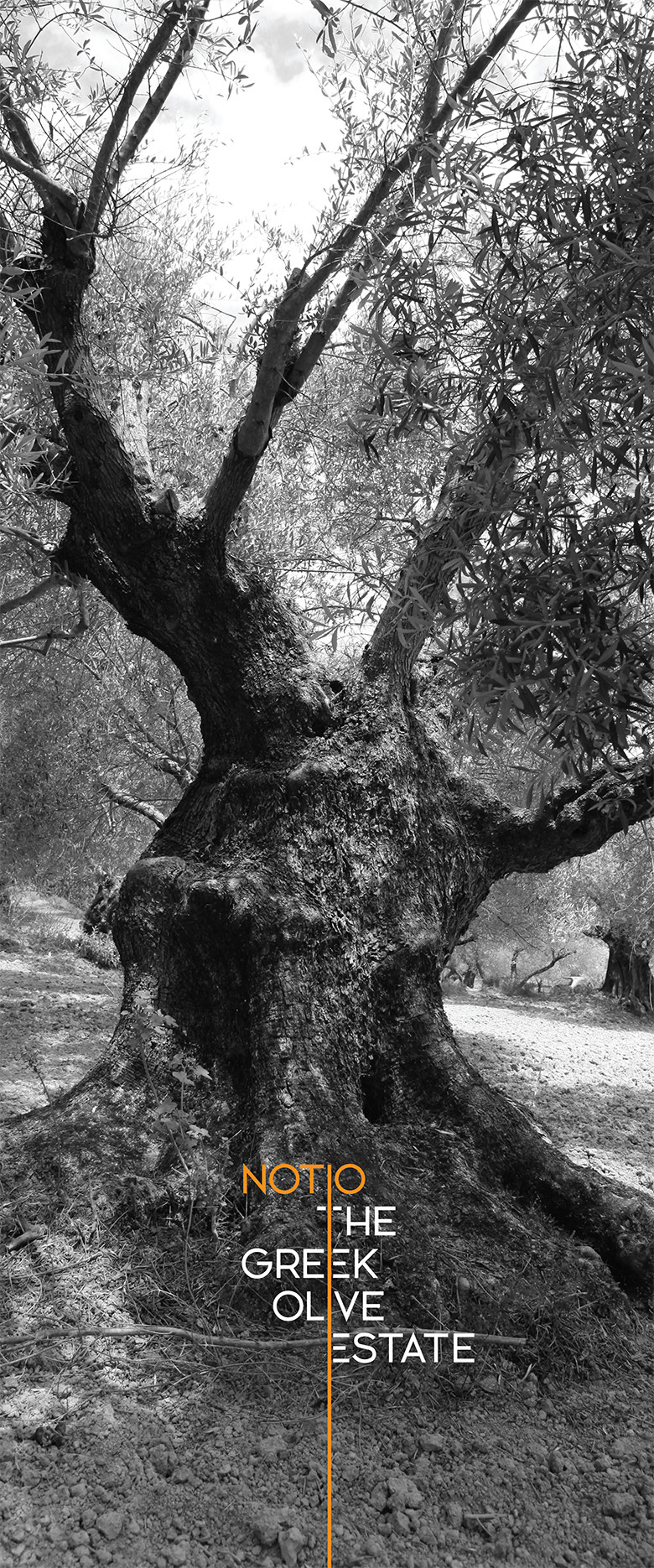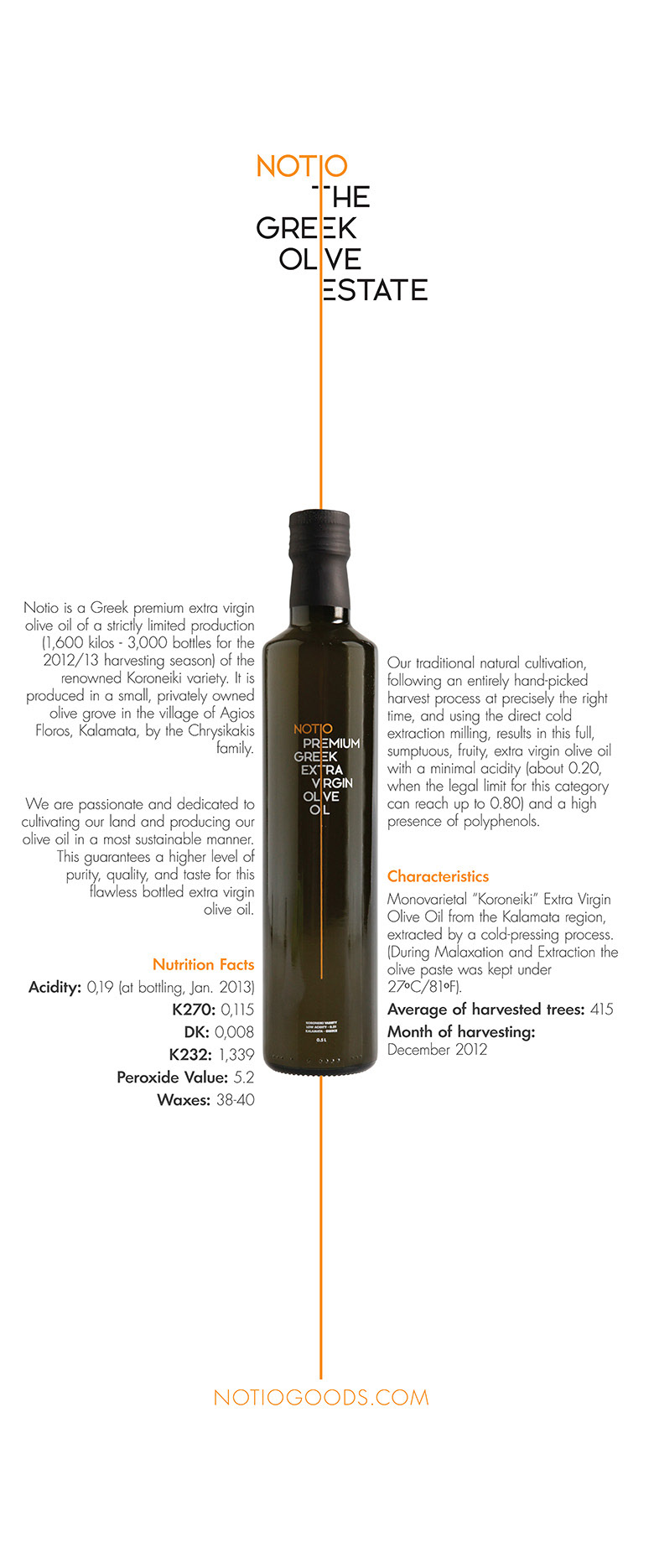
Identity and packaging for Notio Goods, a small family company that produces high quality biological products such as premium extra virgin olive oil and olive leaf tea. Notio products are produced in the company’s estate which is located at the village of Agios Floros in the Messinia region on the south of Peloponnese in Greece.
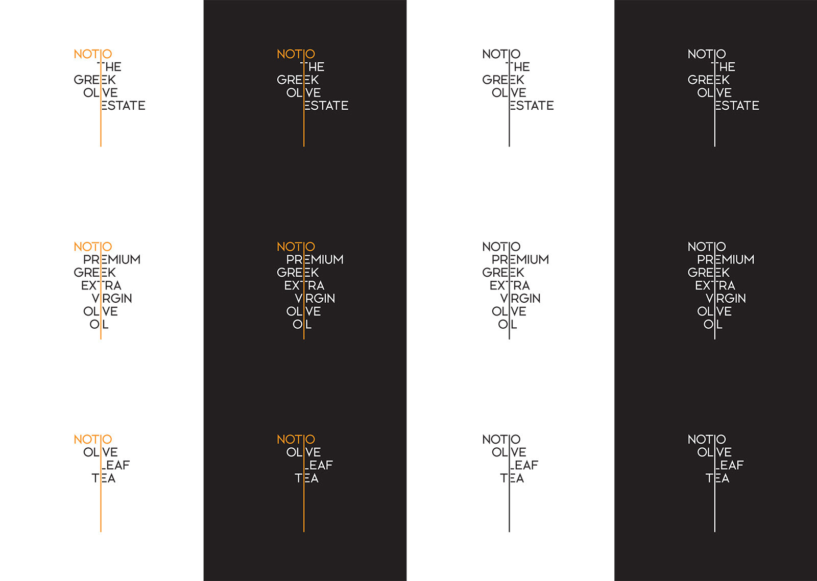
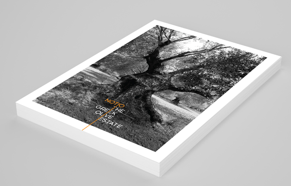
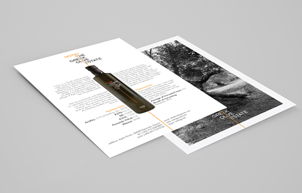
The idea behind the design: One of the initial goals was to make clear that Notio Goods is a company that is proud of its Greek and more generally, south-European roots. In the European South, people “see things slightly differently”. As a result, outsiders usually get the impression of disorder, whereas in reality it is just a matter of a different logic, a different set of rules that may not always be what they are used to, but that ultimately work.
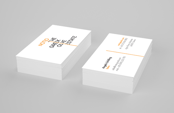
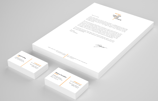
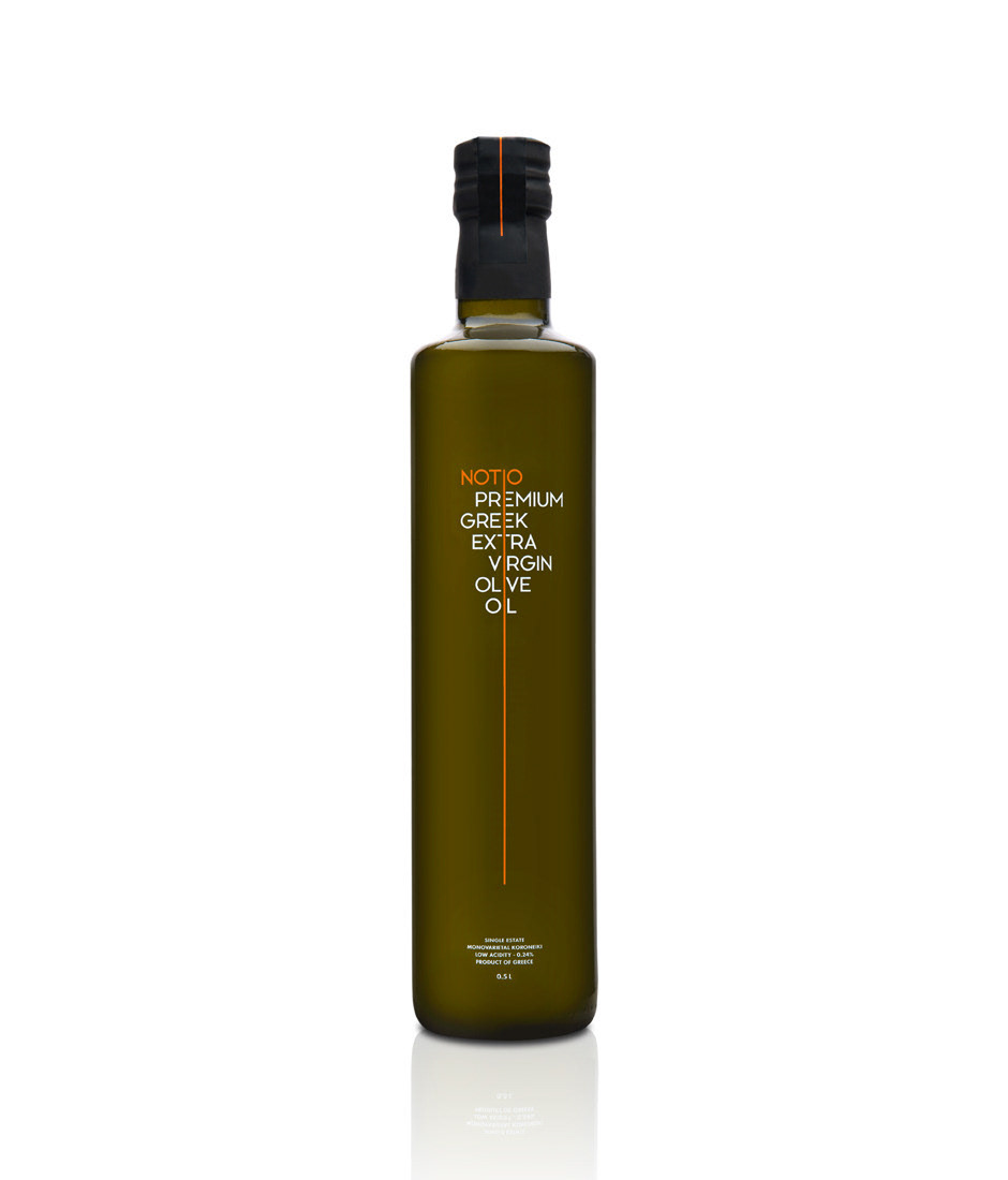
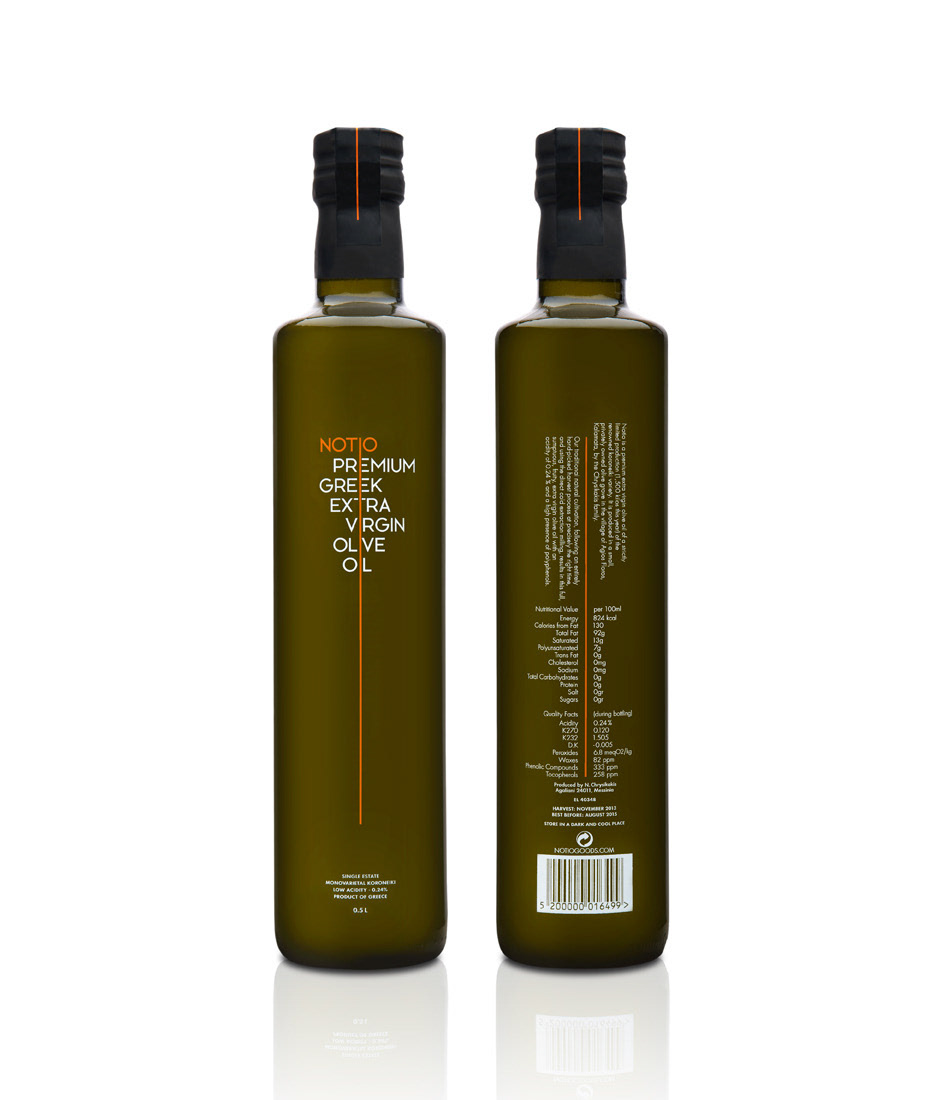
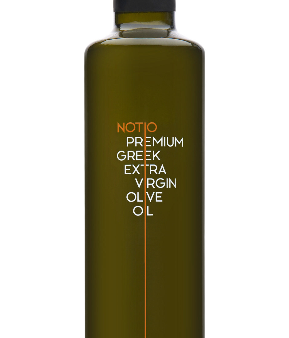
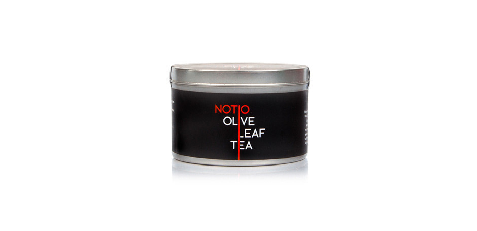
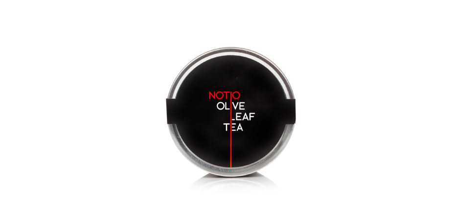
Similarly, the letters that form the brand name on the all the packaging and throughout the identity of the brand, on a first look may appear disorderly, as there is no apparent alignment. A closer look will reveal that the alignment of each word is based on a central axis that unites all the typographic elements. This axis symbolizes durable Greek values, such as simplicity, purity and clarity. The typeface used for the brand and product names was designed by the Comeback from scratch.
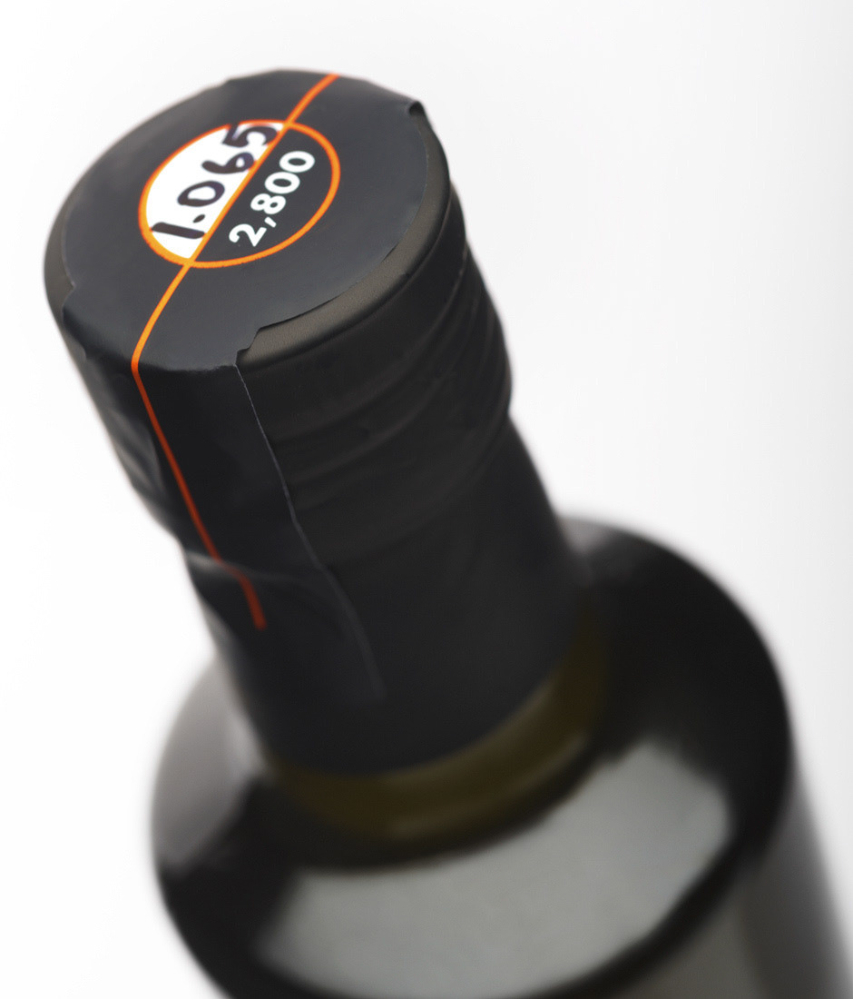
Each bottle is individually numbered, with its unique number written by hand on the top of the safety strip that secures the cap. Notio Extra Virgin Olive Oil won a merit at the 2014 Greek Design & Illustration Awards (EVGE) in the Olive Oil Packaging category and a Star (3rd place) at the Great Taste Awards in 2014.
Copy: Vasso Kanellopoulou
Label Packaging: Cabas SA
Bottle Screenprint: Kouvelas SA
Photos: Studio Anastassatos
Digital Print: Copyxpress