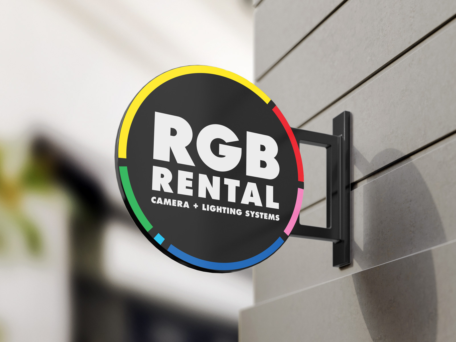
RGB Rental e.K. is a new Berlin-based company which offers digital video equipment as well as anything else a filming crew may need for any project, for hire. From cameras and lenses, to lighting, drones and fog machines.
I was asked to design the logo and identity. The main goals were a) to create an image for the company which would help it stand out against its competitors in the region of Berlin and b) to focus on the digital aspect of modern film making.
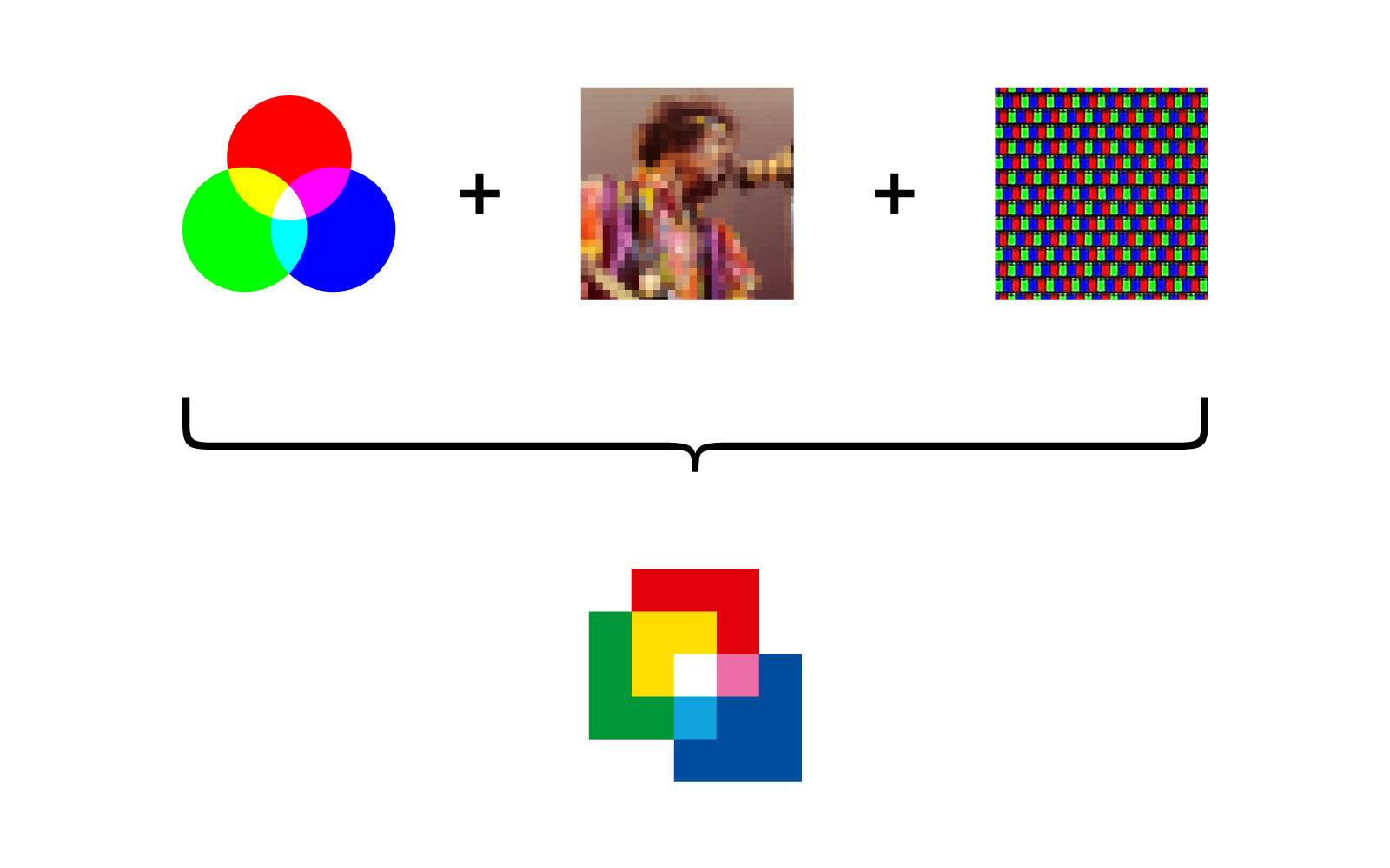
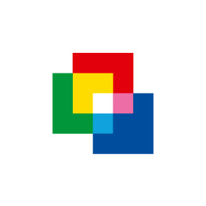
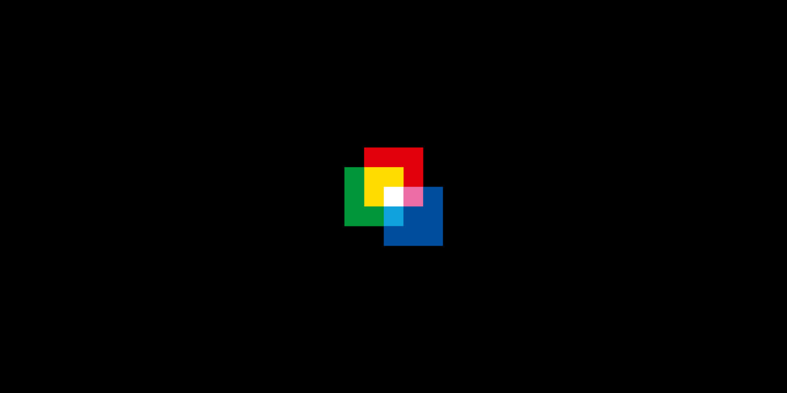
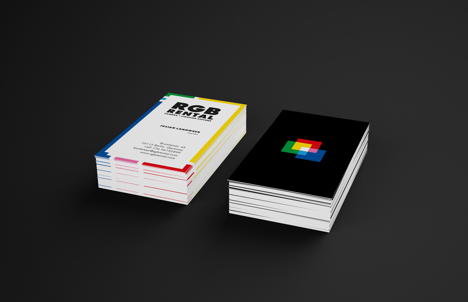
The first step was the creation of the Pixel symbol. The RGB colour model is an additive colour model in which red (R), green (G), and blue (B) light are added together in various ways to reproduce a broad array of colours. The forms interact with each other imitating the way the RGB colour model works. Their shape is square so that on one hand they look like the pixels, the building blocks of any digital image, and on the other, like the actual screen diodes that emit the 3 basic colours and make the the display of any digitally reproduced picture possible.
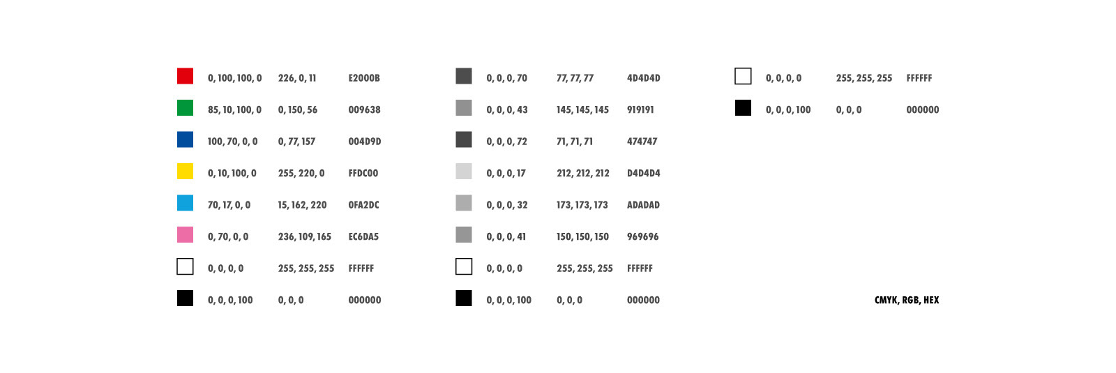
Colour Values (colour, grayscale & monochrome)
Since true RGB colours cannot be printed, colours that are closer to what we perceive as "true" red, green, blue, etc are used instead. These are the colours that are also used throughout the identity, with the addition of two more, white & black, for backgrounds and the typography.
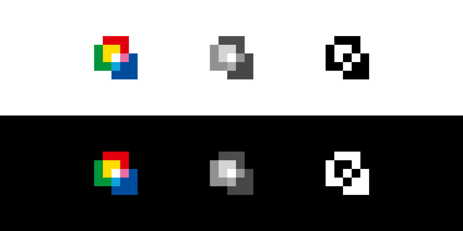
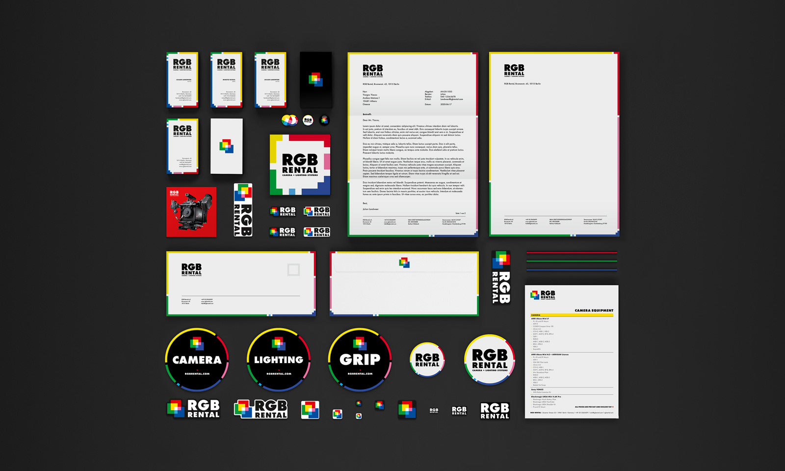
Pixel symbol, coloured, grayscale & monochrome (positive and negative)
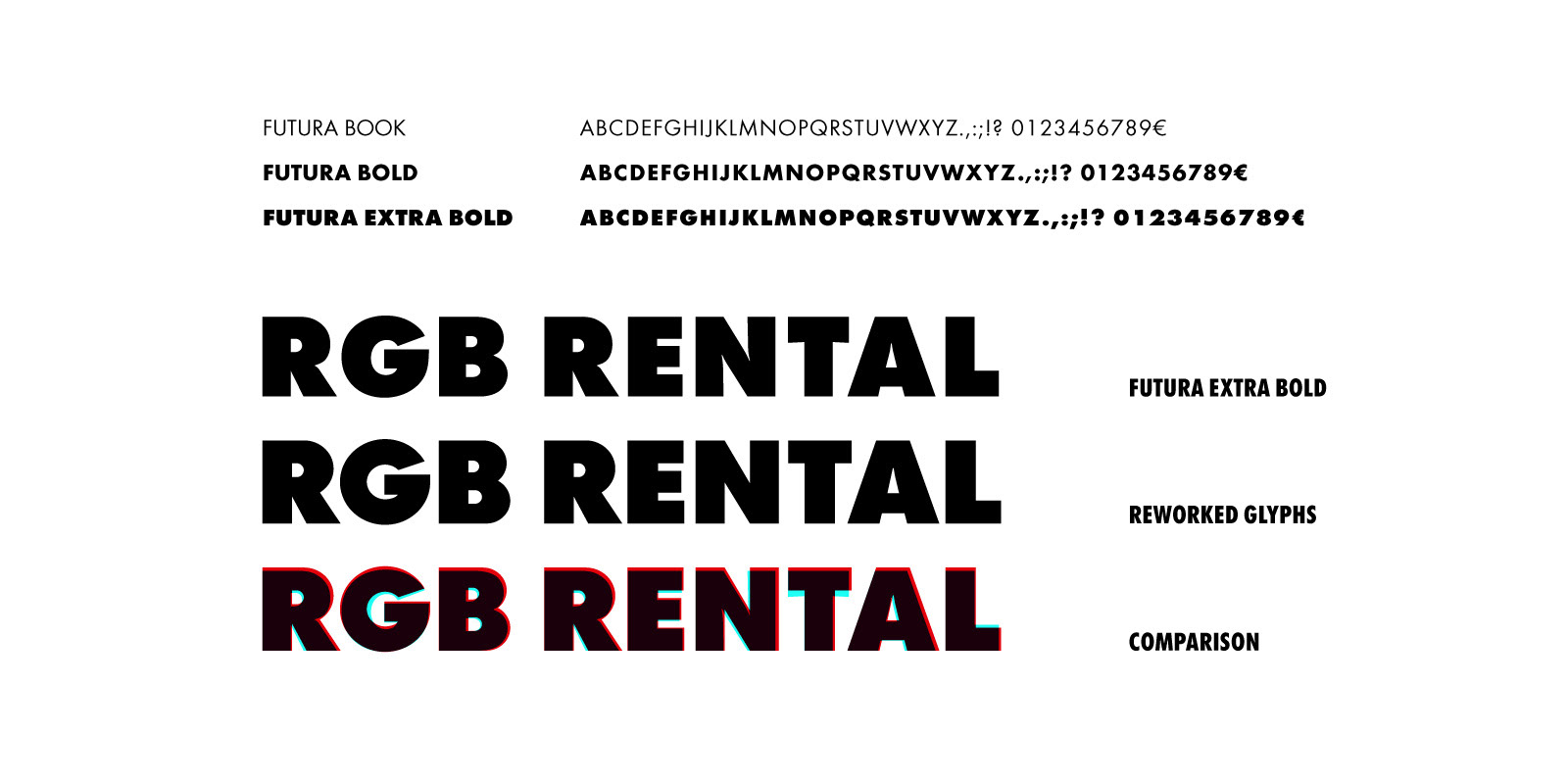
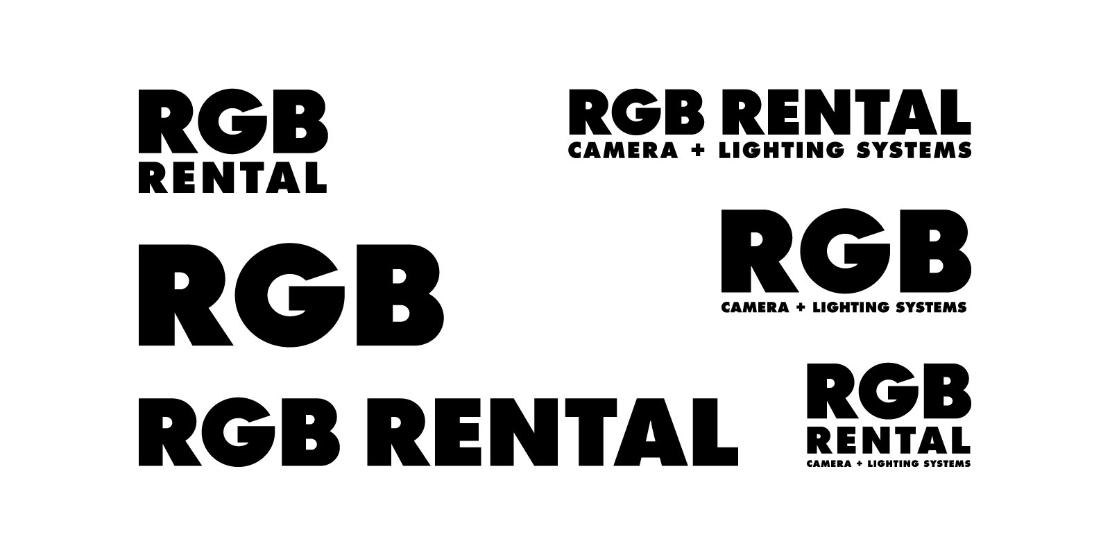
For the typography, three weights of the classic Futura are used. Futura was selected for its simplicity and geometric characteristics that work well with the symbol and other elements of the identity. Be that as it may, the glyphs that make up the name of the company were reworked in order to further simplify their forms and remove details such as ink traps that are unnecessary for the logo. Spacing was also tweaked.
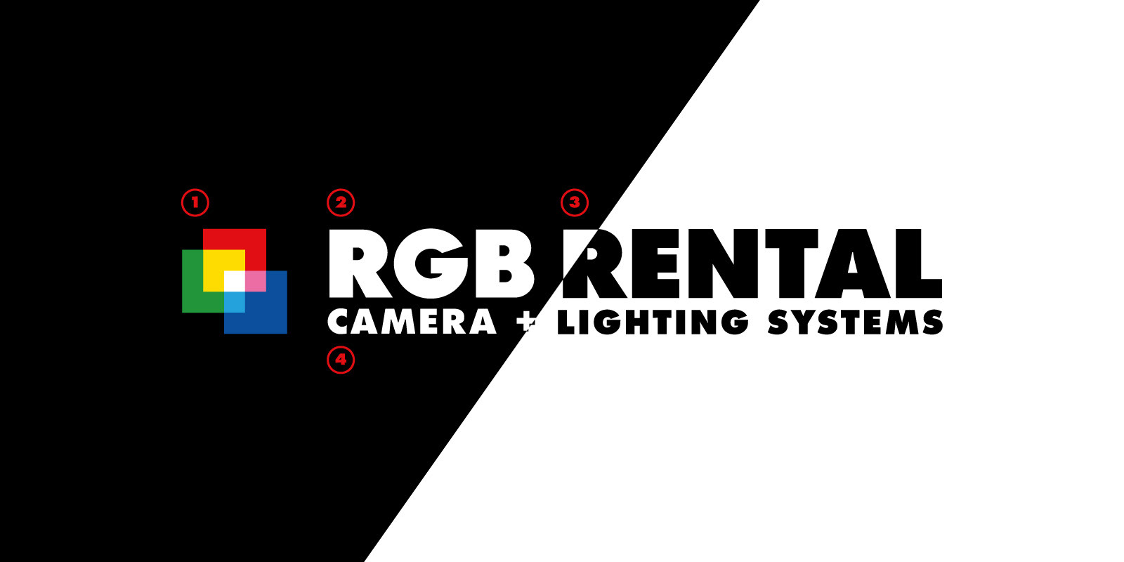
The elements that make the logo:
1. Pixel, 2. Name, 3. Service, 4. Subtitle (positive and negative)
1. Pixel, 2. Name, 3. Service, 4. Subtitle (positive and negative)
Finally, since the new logo is used in various applications such as stickers of several sizes and shapes, it was further developed into a responsive logo system. The name "RGB" is the only constant out of the four elements that make the basic version of the logo.
The other three can be used or not, depending on what works best for each application.
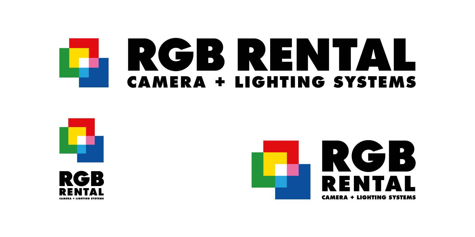
Main logo versions, Horizontal, Vertical & Compact (all logo elements used)
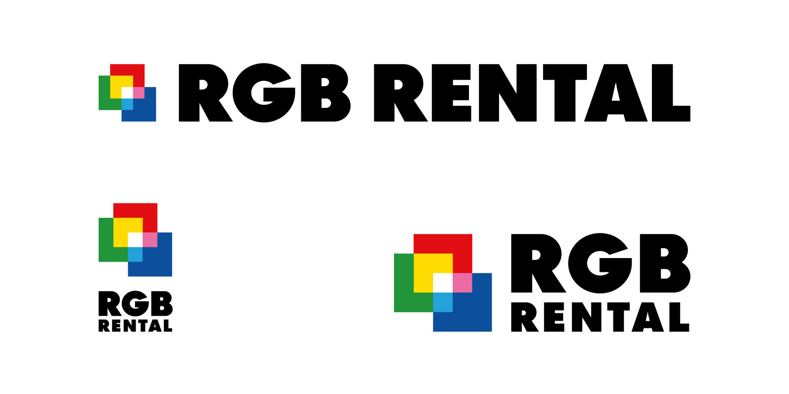
Horizontal, Vertical & Compact (Pixel, Name & Service)
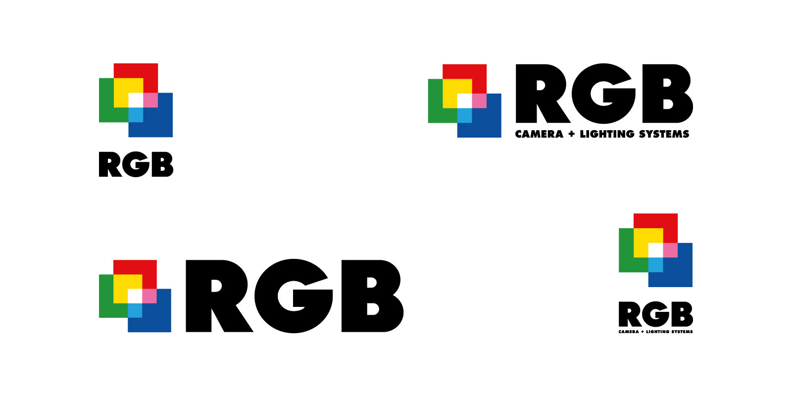
Verticals & Compacts (Pixel & Name, with and without Subtitle)
Typography only Versions (Name & Service, with and without Subtitle)
Pixel only (negative)
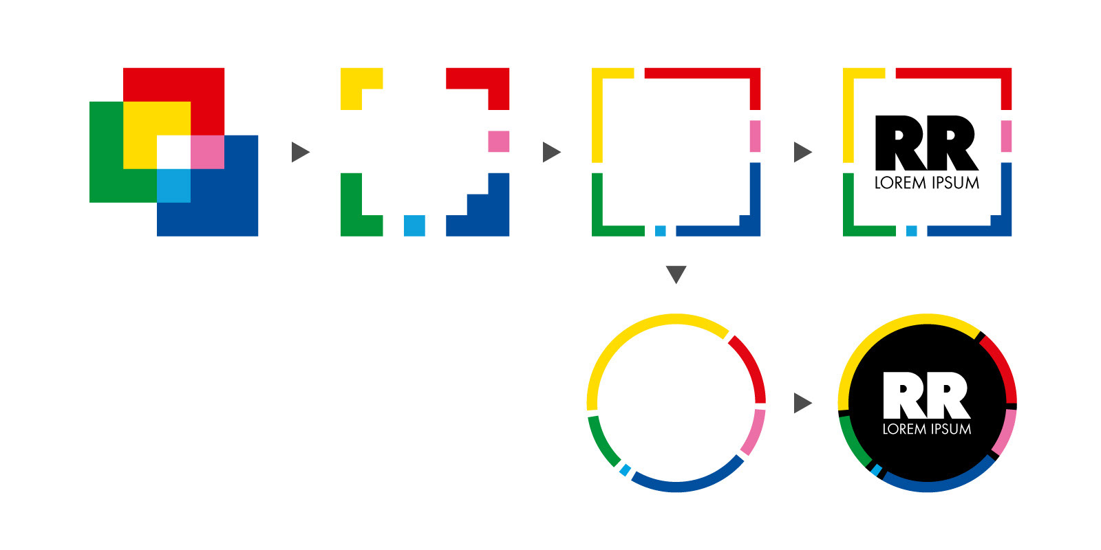
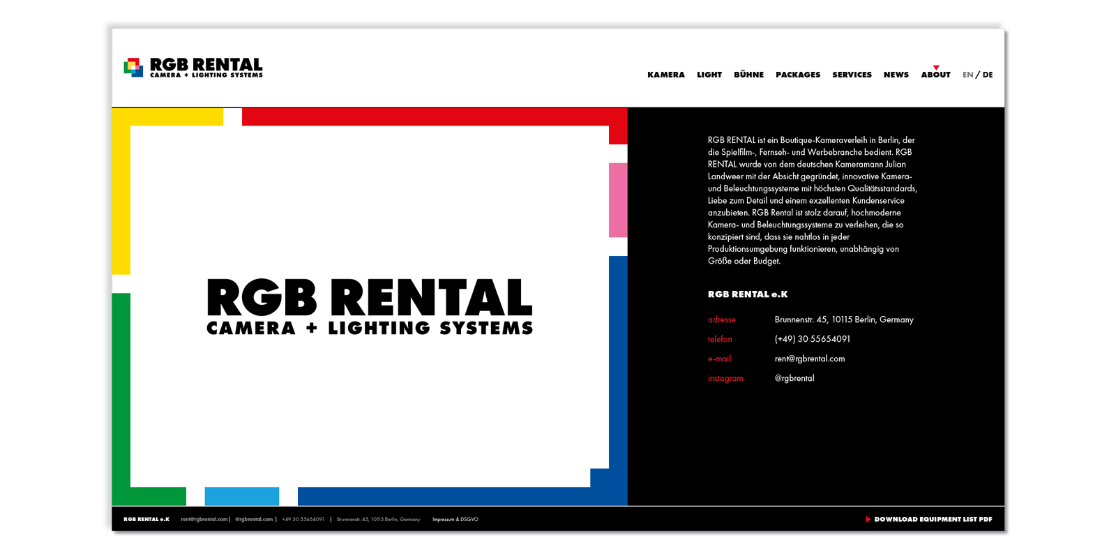
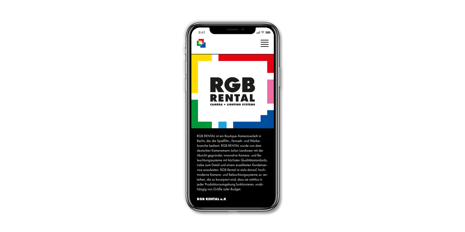
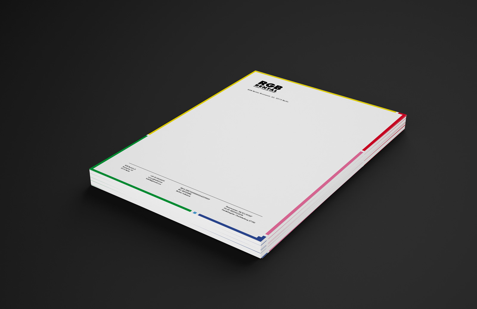
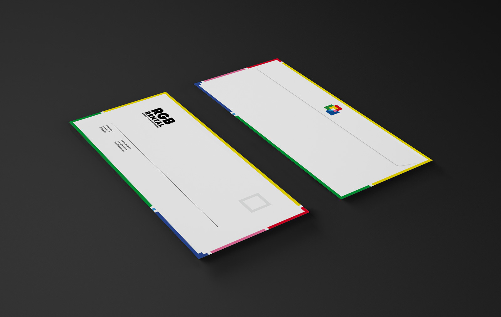
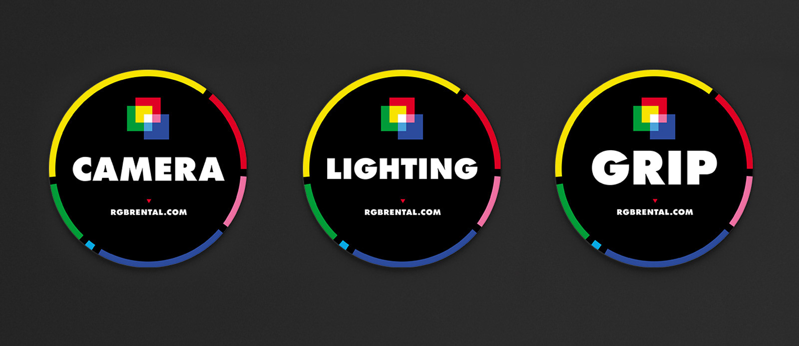
The last element of the identity is a structure that was created directly out of the Pixel symbol. The shapes that make the symbol were taken apart and rearranged into a flexible "frame" that sits on the edge of the canvas that is available for each new application. Its function is to serve as a vehicle that a) carries the identity colours when the Pixel symbol can not be used or is unnecessary, b) contains and structures all information contained within it, and c) provides the identity applications with further uniformity and coherence.
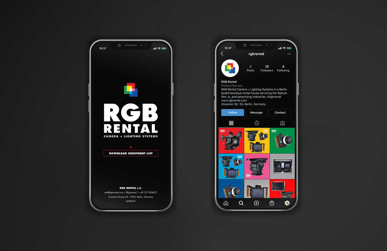
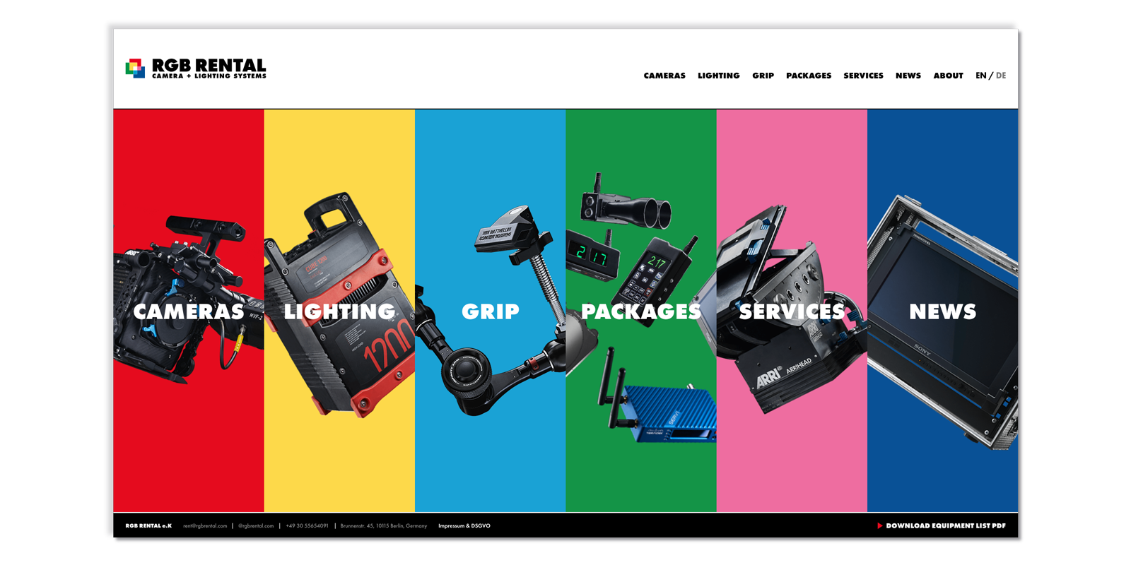
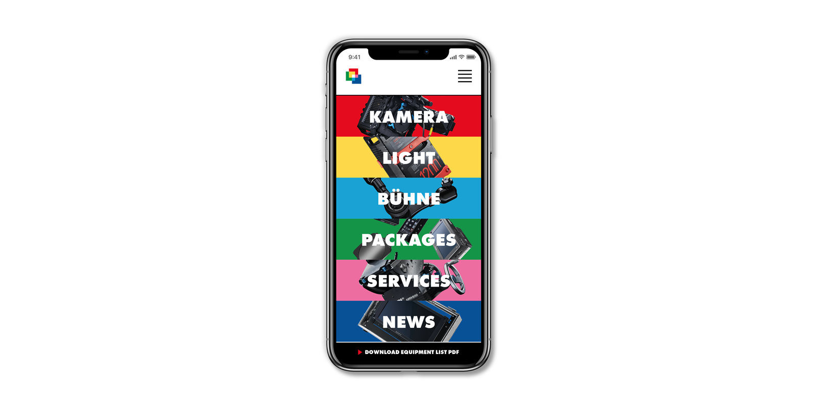
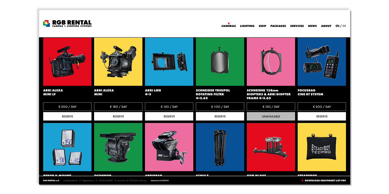
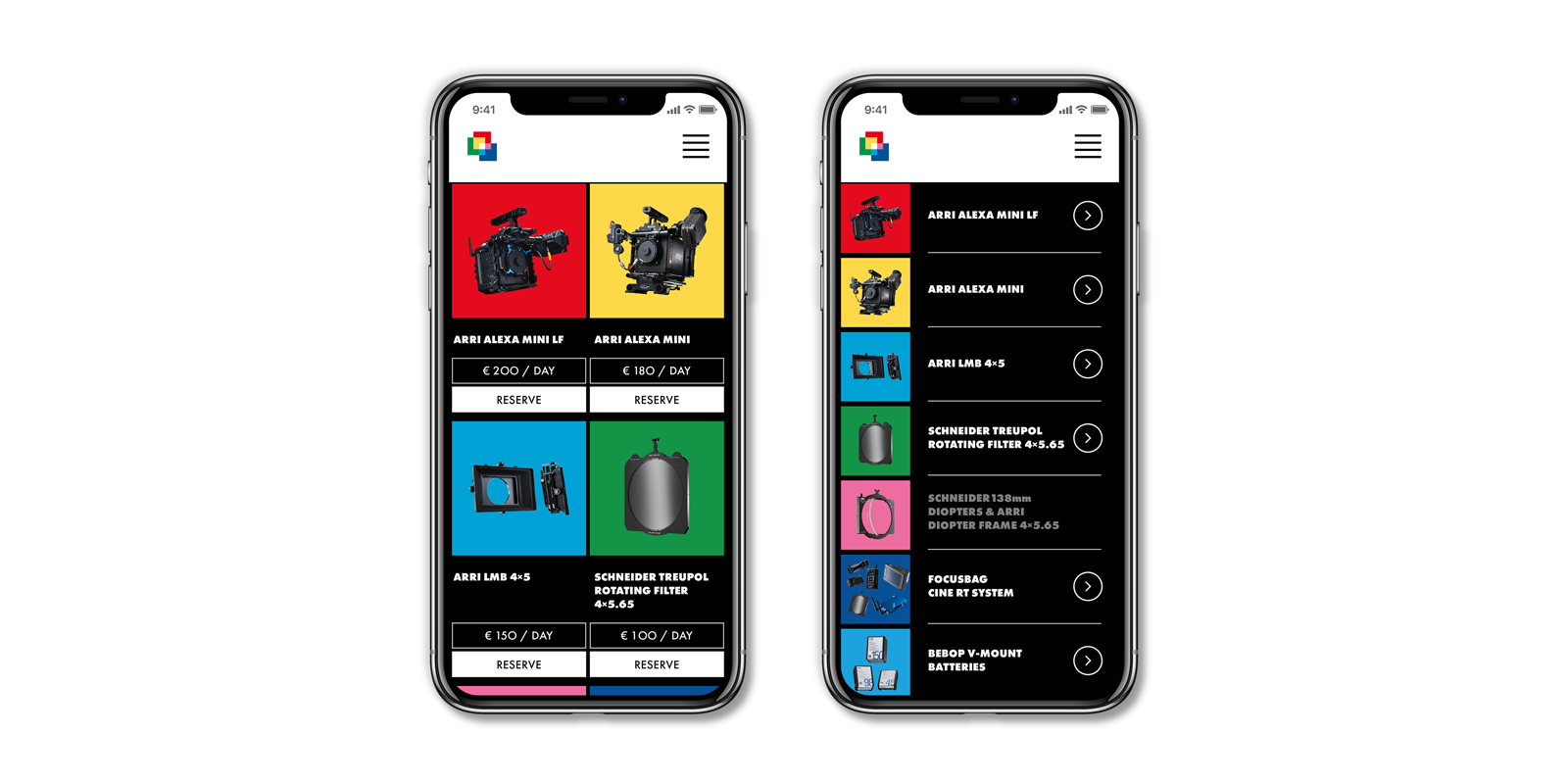
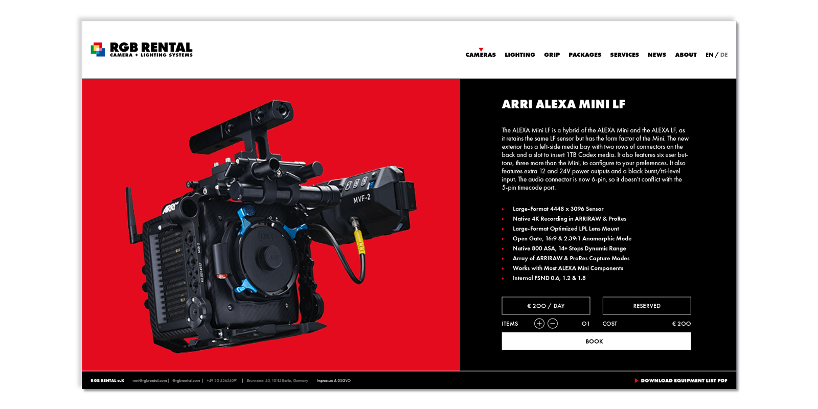
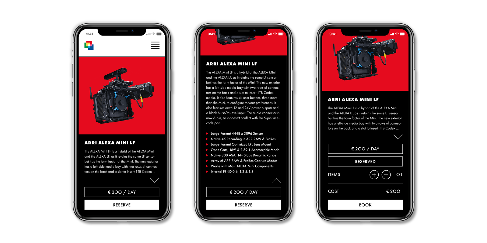
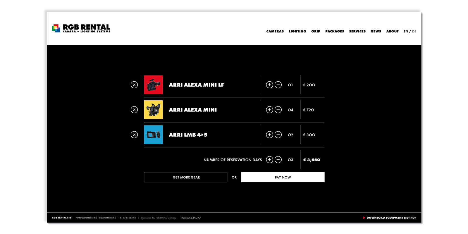
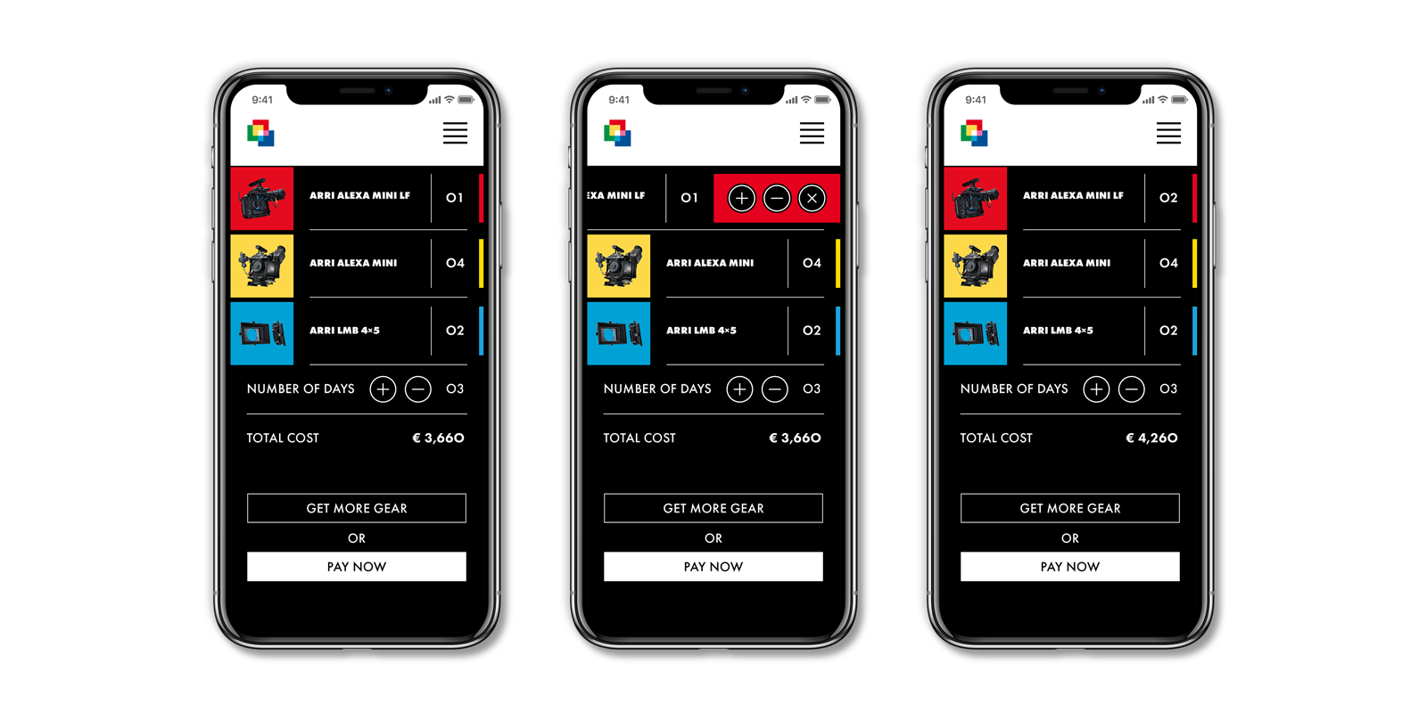
The second stage of the project was to design the company website and equipment renting service. The goal was to build on what we had already done with the identity, further strengthen the company image, and help the company stand out against its competitors in the region of Berlin.